What Happens When Screen Orientation Changes in a Safari Web App?
With Apple's recent introduction of Safari 26 and the ongoing evolution of WebKit, understanding how screen orientation changes affect web apps on iOS has never been more critical. Developers building portrait-landscape web apps and thinking about responsive breakpoints for iOS need to grasp the nuances of orientation change handling, especially as Home Screen websites now open as web apps by default. In this article, we'll dive deep into what truly happens when users rotate their devices in Safari web apps, how Apple's latest updates impact this behavior, and why manifests and service workers still play a pivotal role in delivering rich, app-like experiences.
Apple’s Safari 26: A Turning Point for Home Screen Web Apps
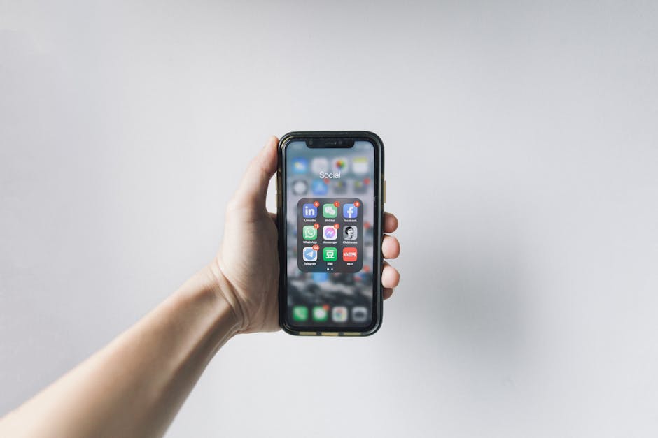
One of the most significant changes in Safari 26 is Apple's decision to make websites launched from the Home Screen open as web apps by default. Before this change, many developers had to rely on complicated heuristics or user actions robservatory.com to enable "app-like" launch behavior, often involving the use of the apple-mobile-web-app-capable meta tag. Safari 26 simplifies this by defaulting to an app-like environment, eliminating the need for special installability requirements – at least for basic web app behavior.
- No special installability needed: Previously, developers felt obliged to trigger specific flags or go through complicated installation prompts. Safari 26 shifts this paradigm.
- Home Screen web apps now get standalone windowing: When a user adds a website to their Home Screen, launching it no longer opens Safari’s browser UI but enters a standalone web app mode.
- Unified experience across devices: This move by Apple aligns more closely with native app expectations and responsive design strategies for iPhone and iPad.
This change underscores Apple's investment in WebKit as a platform for rich, native-like apps that live on the web but behave like installed software — without requiring App Store installs. Browser-first services can feel truly “app-like,” further validating the web as a serious software distribution model.
Screen Orientation Changes in Portrait-Landscape Web Apps
What happens when a user rotates their iPhone or iPad in a Safari web app? Let’s break down the orientation change handling mechanism in the context of Apple’s ecosystem.
1. The Event Lifecycle: Orientation Change Events
When a device’s orientation switches between portrait and landscape, Safari emits events that developers can listen to, chiefly:
- orientationchange event on the window
- resize event on the window
These events are essential for responsive breakpoint handling because they give developers a hook to adjust UI and reflow content based on the new device orientation and viewport dimensions.
2. Viewport and Layout Updates
Safari’s WebKit engine adjusts the viewport dimensions dynamically when orientation changes, which triggers CSS media queries such as (orientation: portrait) or (orientation: landscape). This feature allows developers to define different CSS rules optimized for each orientation.
Media Query Use Case @media (orientation: portrait) Apply styles optimized for vertical layouts @media (orientation: landscape) Apply styles optimized for horizontal layoutsBecause Safari 26 opens Home Screen web apps in standalone mode, viewport calculations and resize event timings are tightly coupled with the standalone window size — not the traditional browser chrome size. This leads to more predictable and consistent layout changes on orientation shifts.
3. Safari’s Rendering Impact on Orientation Changes
In contrast to native apps where rotation triggers a full layout pass and often UI element repositioning, Safari's web apps rely on CSS and event-driven JavaScript to detect orientation change and re-render components appropriately. The WebKit team has continually improved this experience, minimizing repaint flickering or delayed layout updates on rotation.
However, developers should still anticipate these key details:
- No automatic state preservation: Unlike native apps, the web app lifecycle doesn't automatically rehydrate components or scroll positions unless managed via client-side logic.
- Event firing may differ across devices: Testing on multiple iOS devices (iPhone vs iPad) is crucial because WebKit optimizes orientation events slightly differently depending on screen dimensions.
- Resize event fires after orientationchange: This ordering means developers often use a combination of events for reliable UI updates.
Why Manifests and Service Workers Still Matter
With Safari 26 simplifying the launch behavior of Home Screen websites, you might wonder — do manifests and service workers still play a role? The answer is a resounding yes.
Web App Manifests: The Blueprint for Identity and Behavior
The manifest.json file provides essential metadata about how your web app should behave when launched:
- App icon sets: Safari 26 still uses icons specified in the manifest for Home Screen launchers, overriding generic touch icons.
- Theme colors: A manifest allows fine control over status bar appearance and UI theming during app usage.
- Orientation lock support: While Safari respects the user's ability to rotate the device, a manifest can declare a preferred orientation via "orientation", allowing developers to hint for portrait-only or landscape-only experiences. However, iOS’s implementation here is limited compared to Android.
Service Workers: Offline and Performance Enhancements
Unlike native apps, Safari web apps rely heavily on service workers to enable offline caches, background sync, and push notifications. Although Safari 26 opens web apps by default:
- Service workers remain essential for creating fast, reliable experiences, especially on flaky or expensive networks.
- Orientation changes cause network requests to pause or resume in some edge cases — smart caching via service workers ensures content is available instantly even during these transition moments.
- Developers can also use service workers to prefetch assets optimized per orientation (e.g., different image sizes), shaving critical rendering time post-rotation.
In summary, manifests and service workers are not legacy requirements but instead foundational components that, combined with Safari 26’s default app-like launch, enable richer, more robust mobile web apps.
Responsive Breakpoints on iOS: Best Practices for Handling Orientation Changes
Handling orientation change isn't just about subscribing to events — it’s about delivering UI and UX that respond gracefully to both portrait and landscape modes on iOS devices. Here are some best practices that seasoned mobile web developers swear by:
- Use CSS media queries for orientation and width: Combine @media (orientation: landscape) with min/max-width queries to adapt UI components sensibly on iPhones vs iPads.
- Throttle or debounce resize and orientation listeners: Avoid heavy DOM reflows on rapid rotations to keep animations smooth and reduce input lag.
- Test on actual devices and Home Screen web apps: Simulators can’t fully replicate Safari 26’s standalone mode quirks. Keep a folder of your Home Screen app icons to test launch and rotation behavior firsthand.
- Use viewport units cautiously: iOS Safari has some well-documented quirks with 100vh and similar units, especially on Safari 26’s standalone web apps. Combine viewport units with CSS variables updated on resize events for consistent sizing.
- Preserve UI state on rotation: Use JavaScript to save and restore user position, form entries, and transient UI states instead of relying solely on CSS.
Putting It All Together: What the Future Holds for Orientation Change and Web Apps on iOS
With Apple's commitment to evolving WebKit and Safari (including Safari 26’s game-changing updates), orientation change handling within iOS web apps has become smoother and closer in behavior to native apps.
We’re no longer stuck with the vague and inconsistent app-like behavior headline claims without examples. Apple has shifted the native-web boundary, making browser-first services truly "app-like" without the friction of App Store installs or complex manifests for basic functionalities.
That doesn’t mean developers can ignore the finer details — manifests still provide crucial identity and launch customizations, service workers enable richer offline and performance experiences, and responsive breakpoints demand careful design for portrait and landscape modes.
By blending Safari 26's new default standalone mode with classic web technologies, developers can create iOS web apps that respond intuitively to orientation changes, feel smooth and native-like, and delight users anywhere from the thumb-friendly iPhone SE to the expansive iPad Pro.
Summary: Key Points on Orientation Change Handling in Safari Web Apps
Topic Details Safari 26 Default Behavior Home Screen web apps launch as standalone web apps by default, no special install actions required. Orientation Changes orientationchange and resize events signal device rotation; viewport adapts accordingly. Web App Manifest Still essential for icons, themes, and orientation preference hints. Service Workers Critical for caching, offline support, and smooth content delivery across orientation shifts. Responsive Breakpoints Use CSS media queries by orientation and screen width; test extensively on real devices.Final Thoughts
The combination of WebKit’s steady evolution and Safari 26’s default app-like launches means the days of arguing whether web apps can “just work” like native apps are giving way to practical engineering: providing users seamless, orientation-adaptive experiences right in the browser.
Understanding orientation change handling is just one piece of the puzzle, but it’s an important one to master as you aim to build modern, responsive, and polished web apps on iOS — apps your users will love to launch from the Home Screen and use in any orientation.
Now's the time to revisit your mobile web apps, add them to the Home Screen, test how they behave on rotation, optimize your manifests, service workers, and CSS breakpoints, and truly embrace the new era of browser-first, app-like experiences on Apple devices powered by Safari 26 and WebKit.